Bruce Wood.
Sr Graphic Designer. Currently @ JLL.
With over 5+ years of industry experience as a multidisciplinary designer, I specialize in crafting brand identities that are grounded in thoughtful strategies & visual concepts, aiming to provide authenticity & clarity through design.
CAPABILITIES
I've worked on a wide array of projects, from branding & the digital realm, print & editorial design, to packaging.
EXPERIENCE
Senior Graphic Designer @ JLL
Graphic Designer @ JLL
Graphic Designer @ Riggs Creative
2025 - current
2022 - 2025
2021 - 2022
AWARDS & RECOGNITION
Hermes Creative Awards, 2026 Platinum Winner
Golden Mouse Awards, 2025 Best Static Print Design
Select Projects

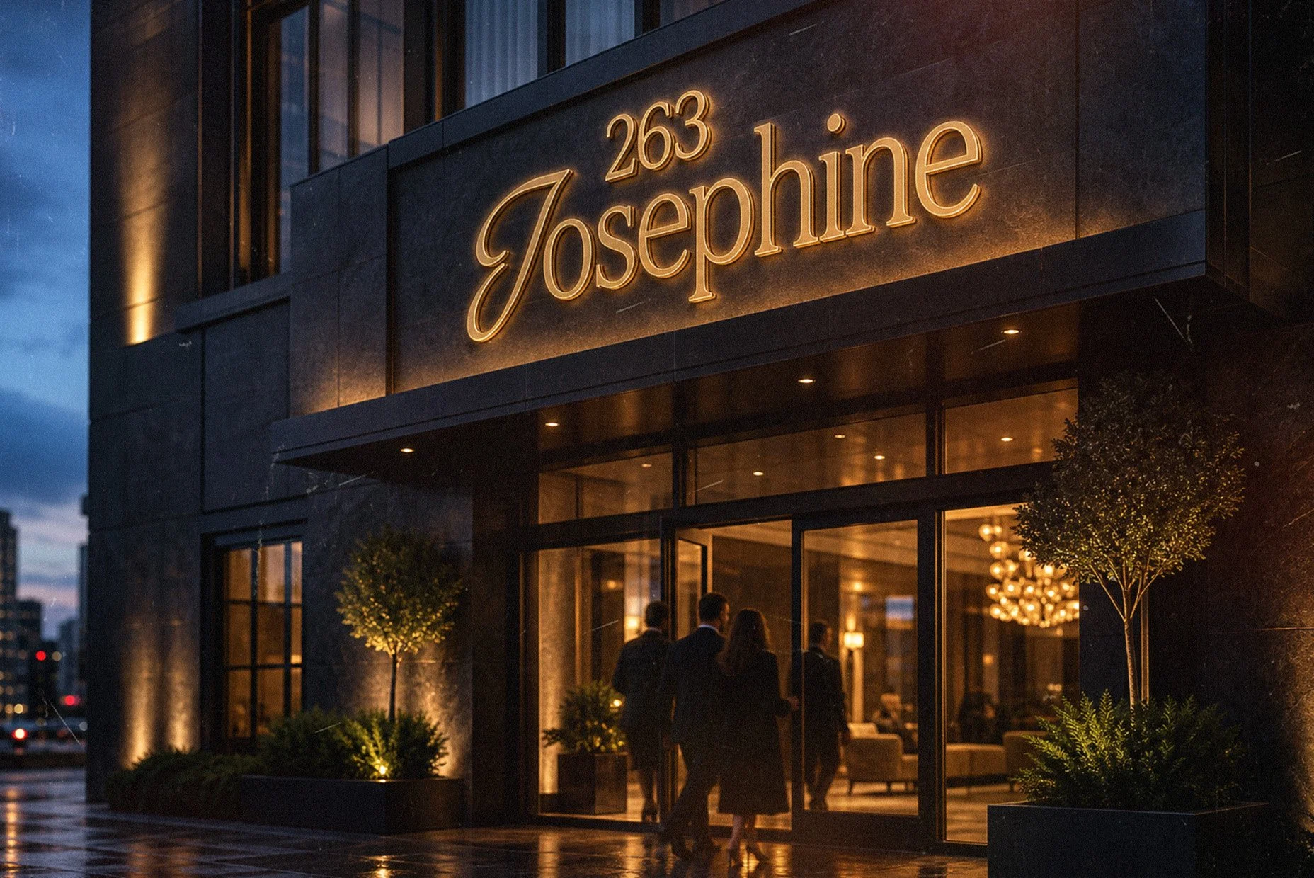
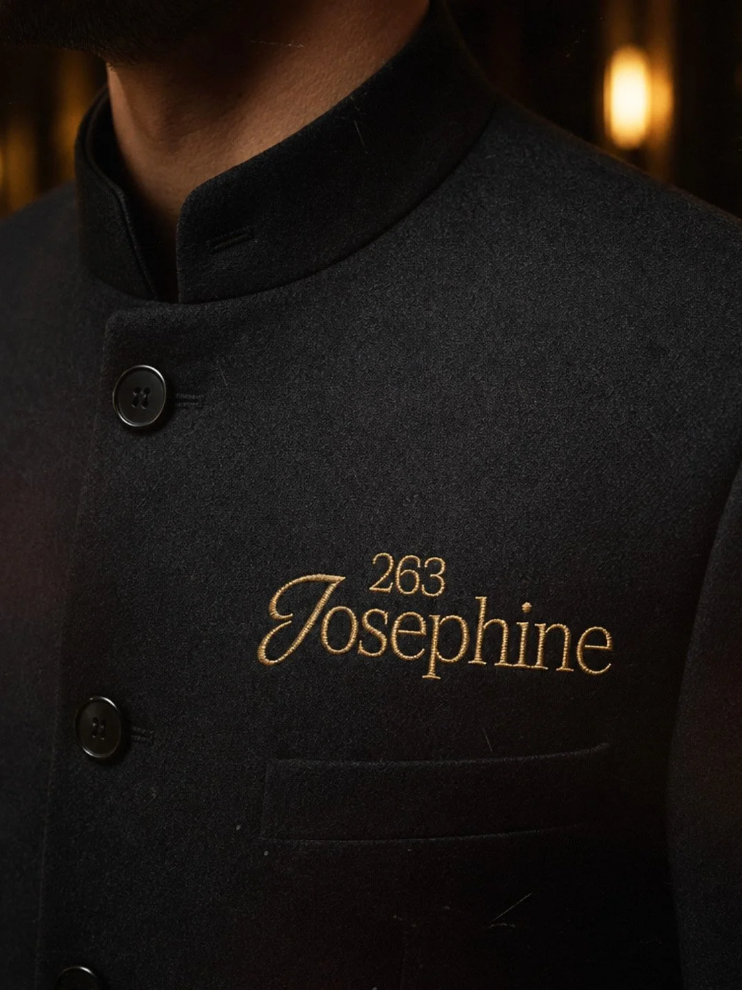
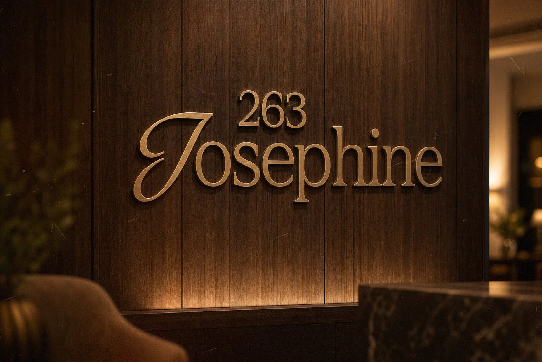
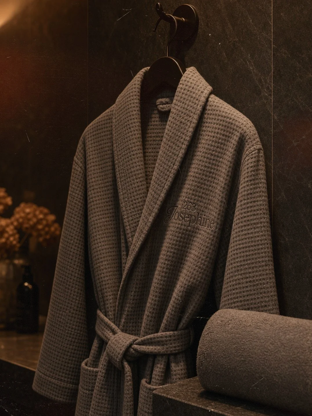
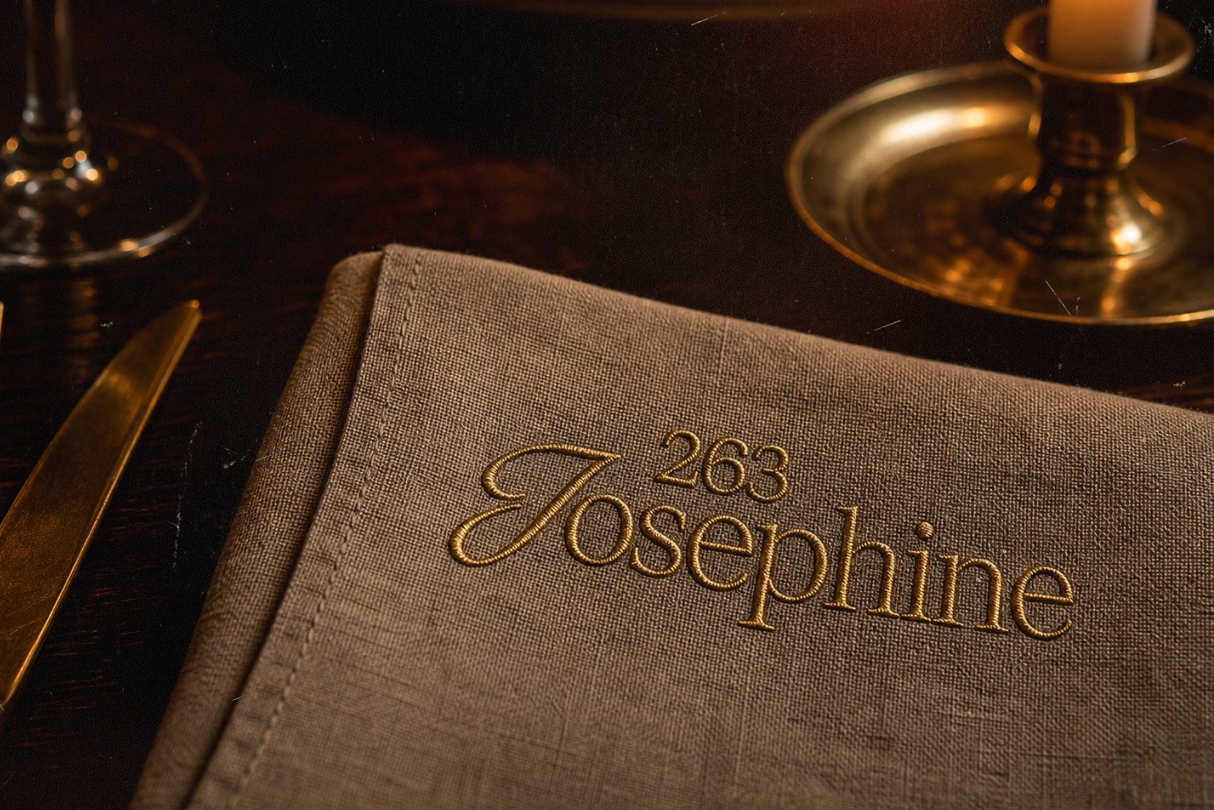
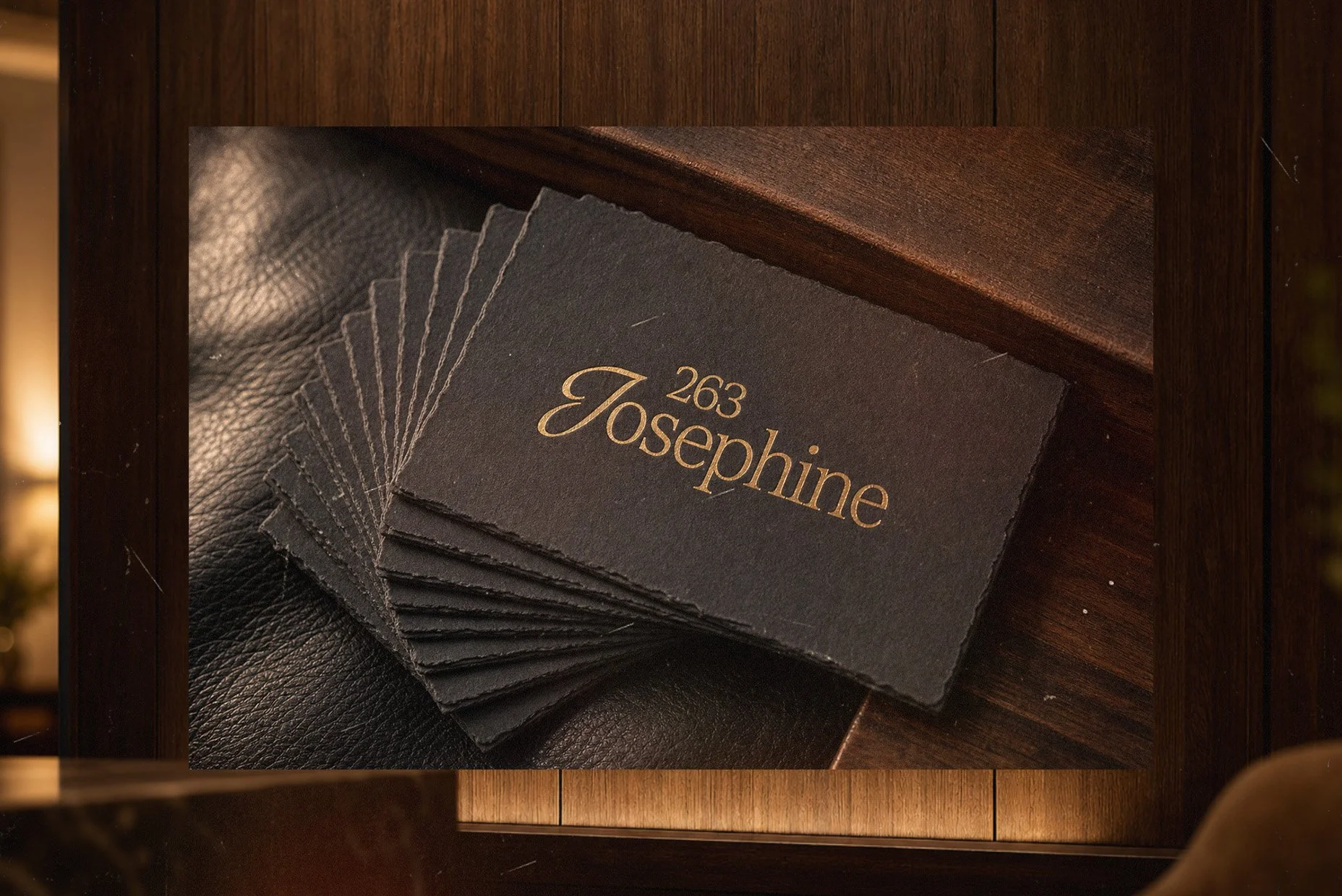
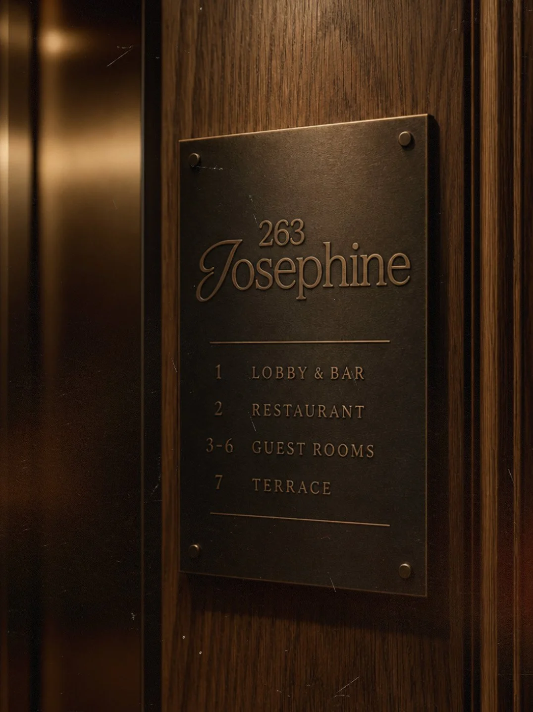
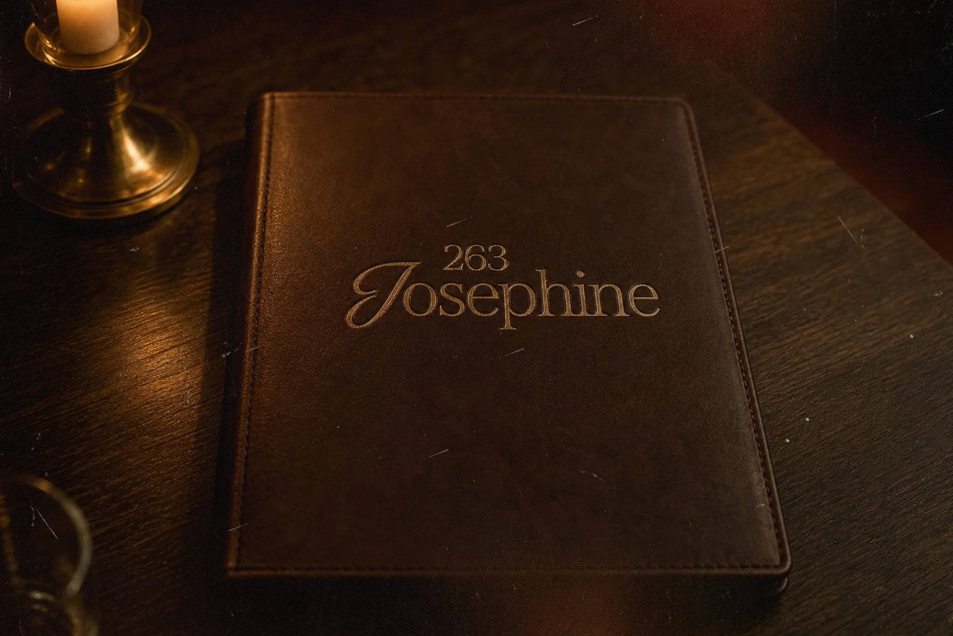
263 JOSEPHINE
CHALLENGE
Create a complete brand identity for a luxury boutique hotel that communicates modern elegance and timeless sophistication in a competitive hospitality market.
APPROACH
I developed a distinctive logo with custom typography that balances personality and enduring class. The art direction focused on warmth and intimacy through rich textures, carefully considered lighting, and inviting color palettes. The comprehensive system extended across all touchpoints—exterior and interior signage, custom bathrobes, glassware, and collateral.
OUTCOME
263 Josephine emerged as a distinctive luxury destination with a cohesive brand identity where every detail contributes to an elevated, memorable guest experience that differentiates the property in the boutique hotel space.
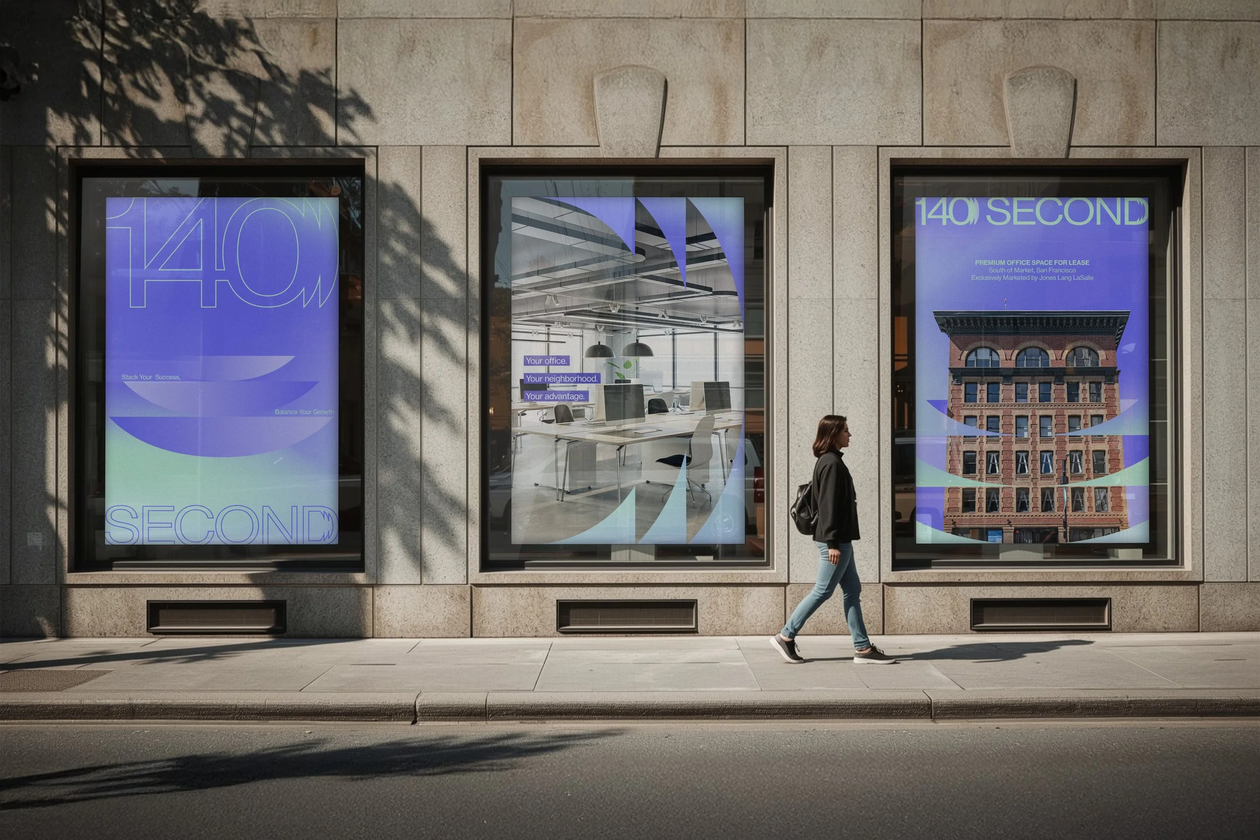
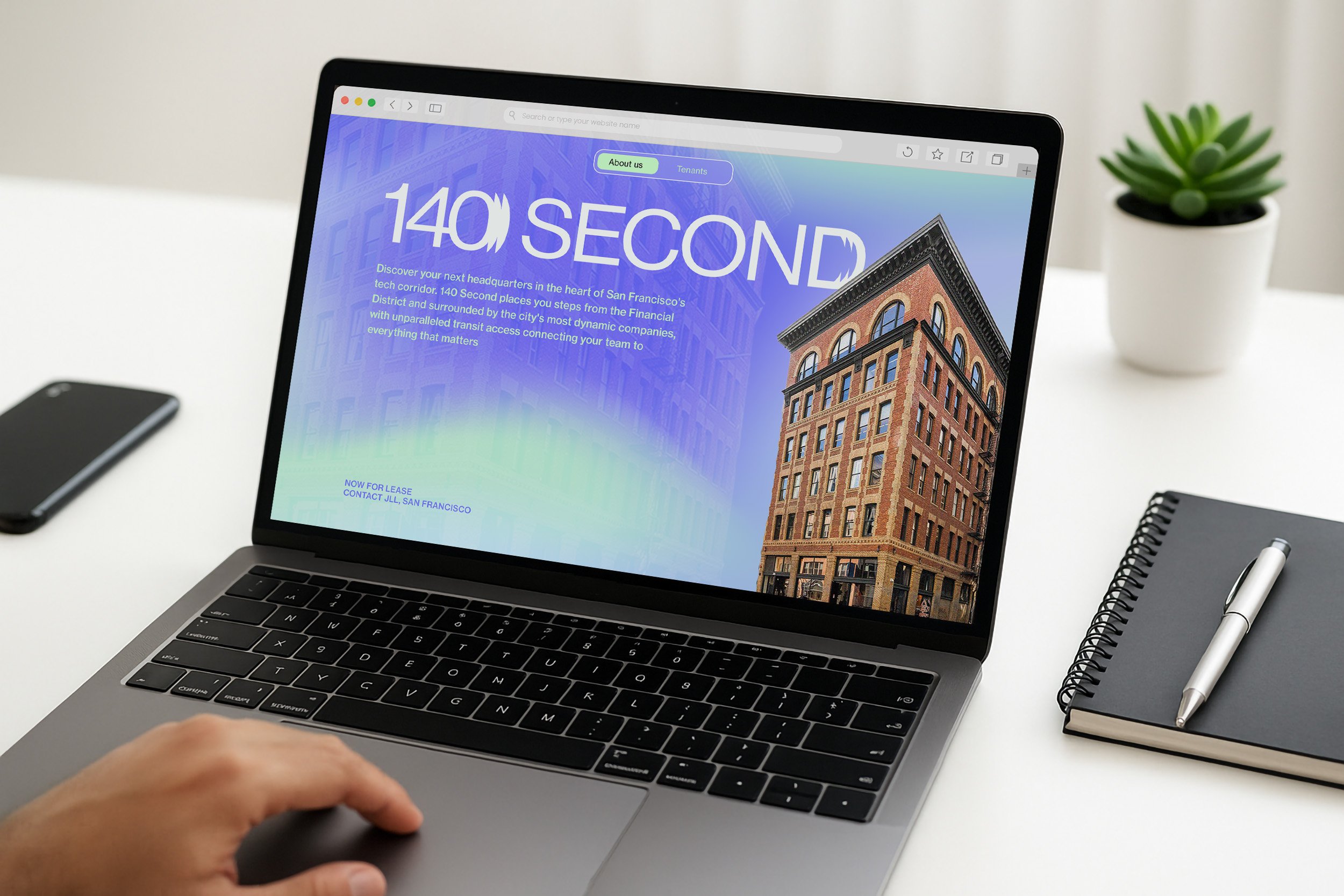
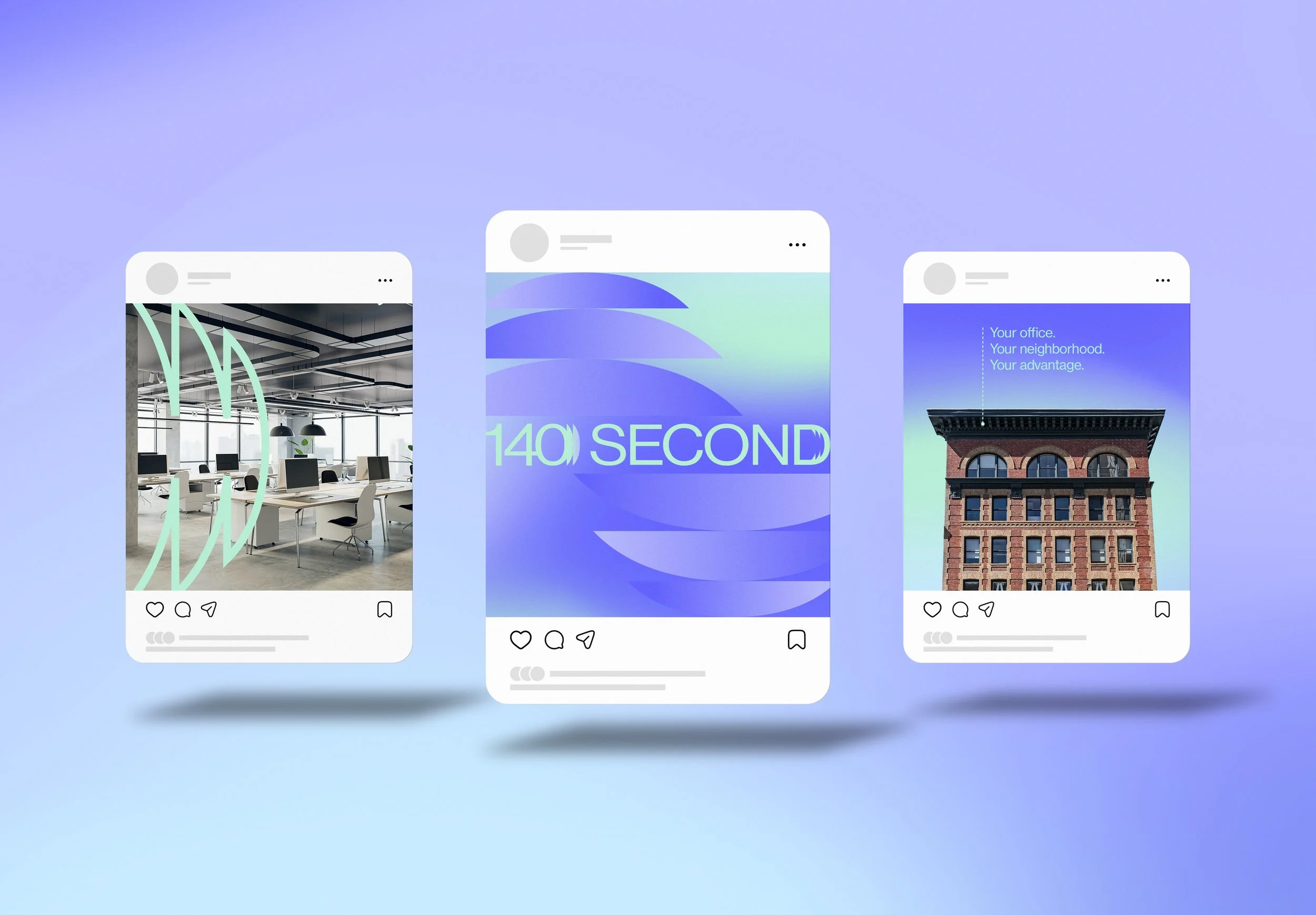
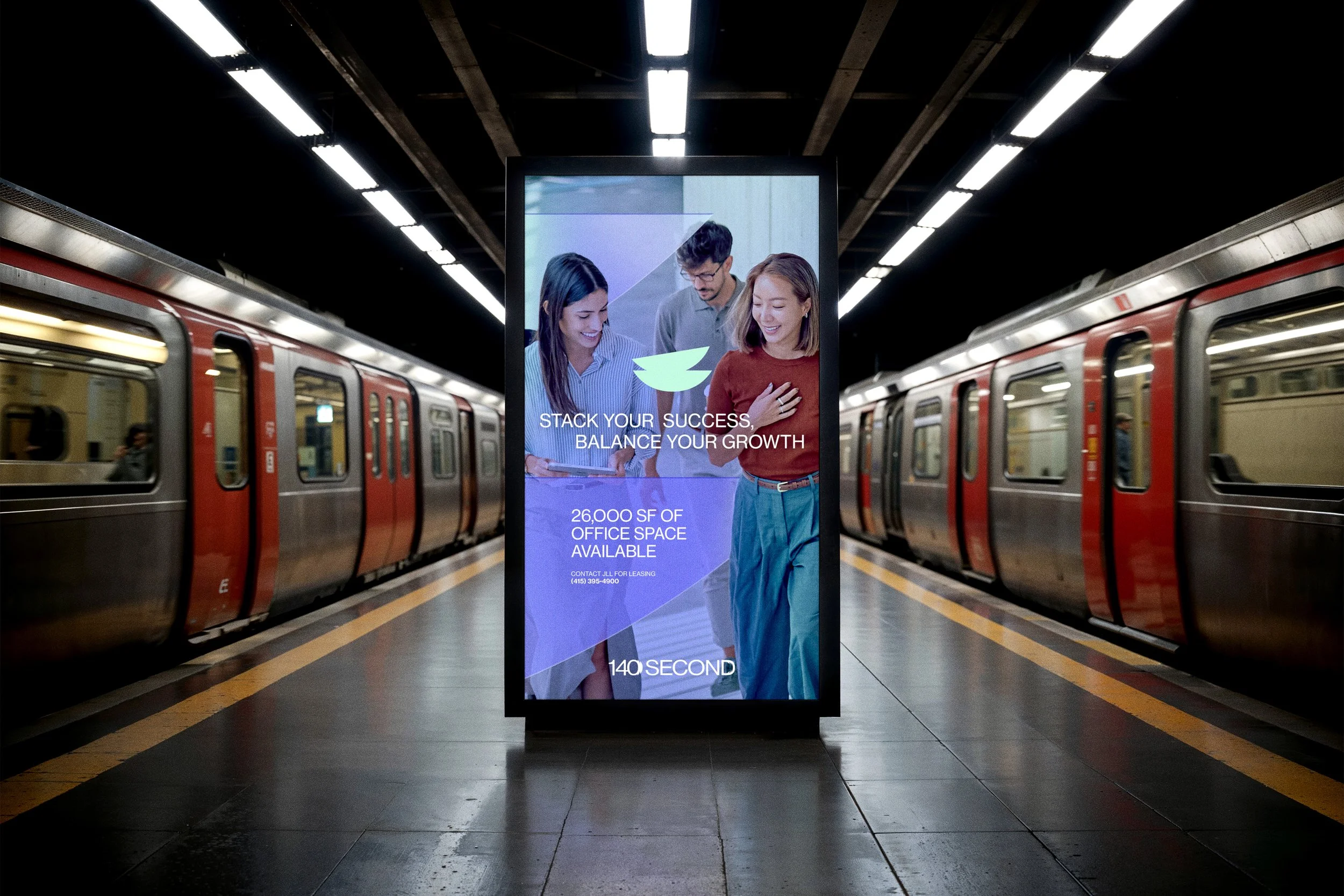
140
SECOND
CHALLENGE
Elevate a Class A office building with mid-tier finishes to compete with premium SOMA properties and attract AI startups and tech tenants.
APPROACH
I developed a bold, modern identity anchored by the building's cobalt blue accents. The system included both icon-based and typographic logo variations that emphasized the distinctive "140 Second" name, setting it apart from generic office branding.
OUTCOME
The brand repositioned the property as a creative tech destination, transforming perception from standard office space to a compelling, design-forward environment that resonated with the target audience.
GLOW
BEAUTY
CHALLENGE
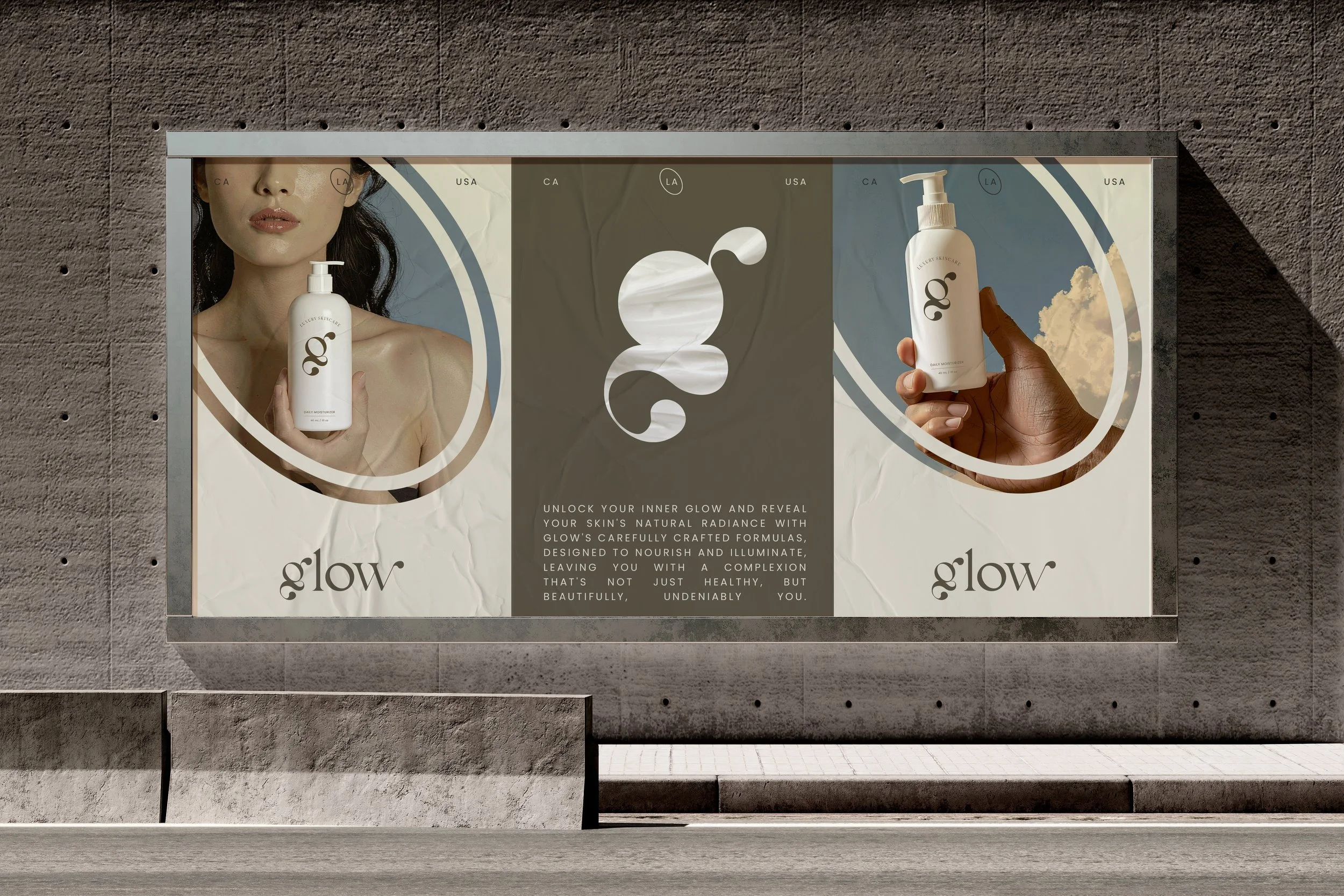
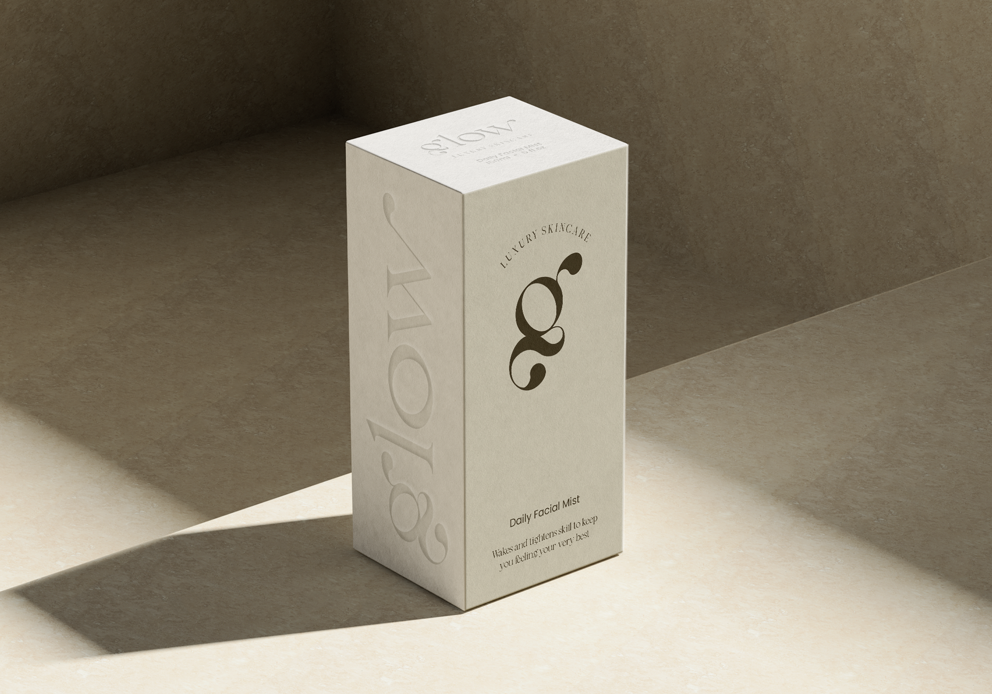
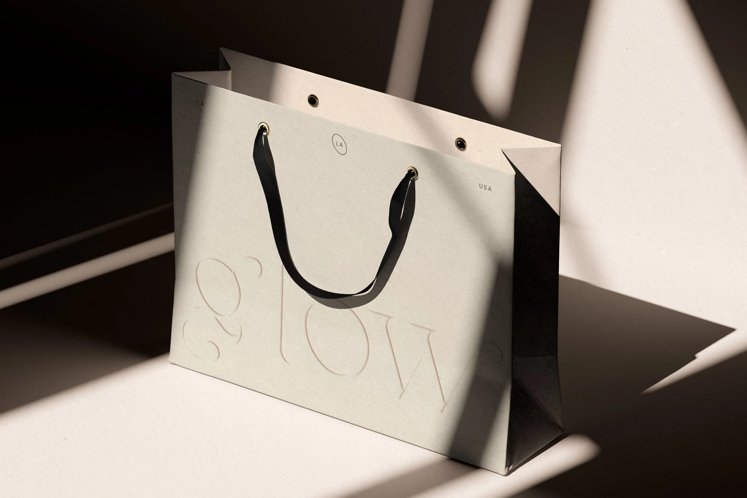
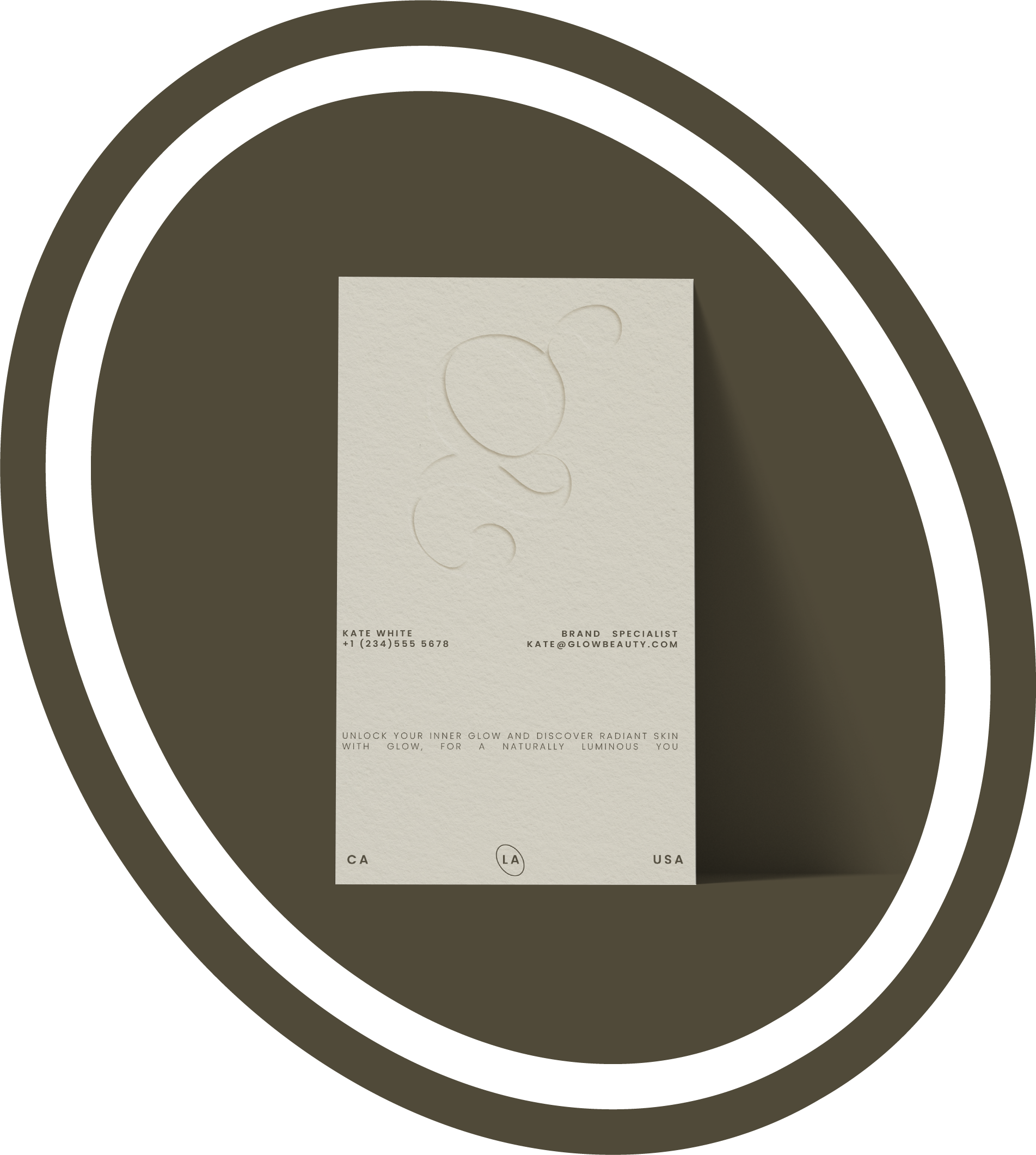
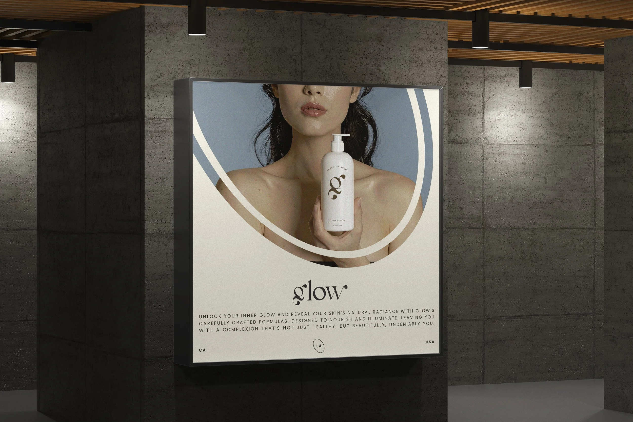
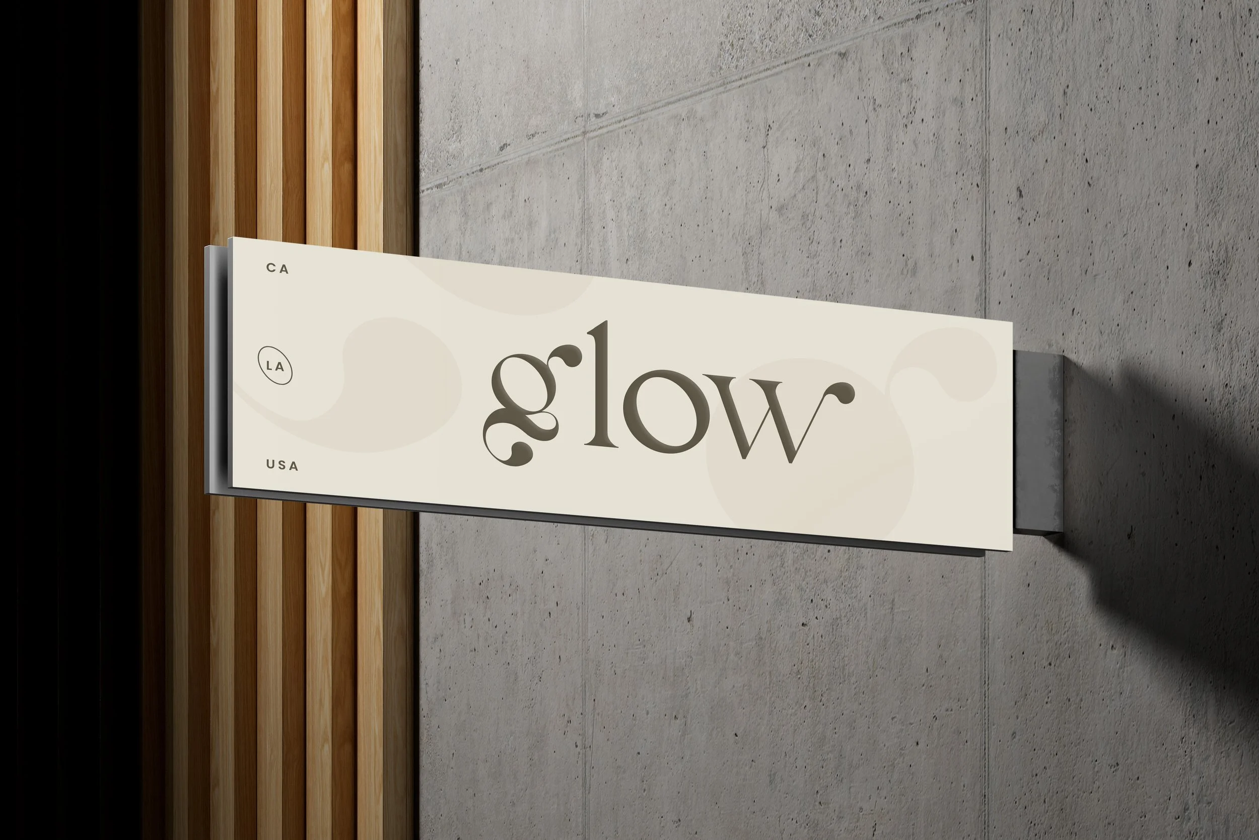
Glow needed a visual identity that would cut through a crowded luxury skincare market while balancing elevated minimalism with warmth and radiance.
APPROACH
I designed a custom wordmark with soft curves and high contrast that embodies both sophistication and approachability. The warm, luminous color palette mirrors healthy skin, while comprehensive brand guidelines—spanning typography, packaging, and tone of voice—ensured consistency across all touchpoints.
OUTCOME
The identity established Glow as a premium, aspirational brand with a cohesive visual language that communicates luxury and efficacy. The flexible system supports future growth while maintaining a distinctive presence in the skincare space.
RIVERPORT
CHALLENGE
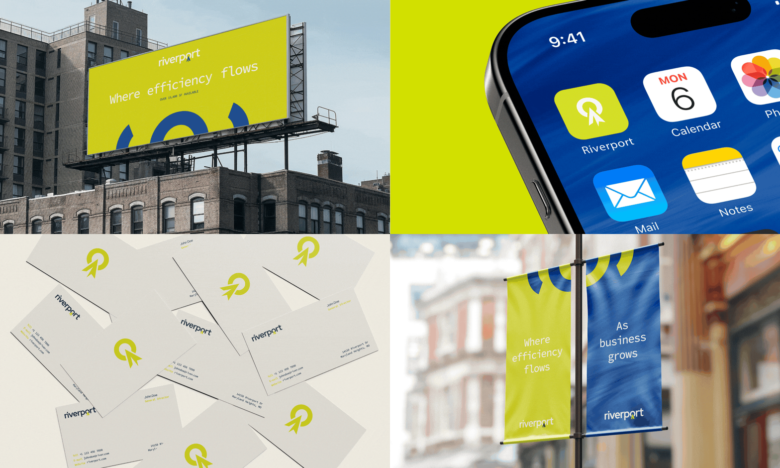
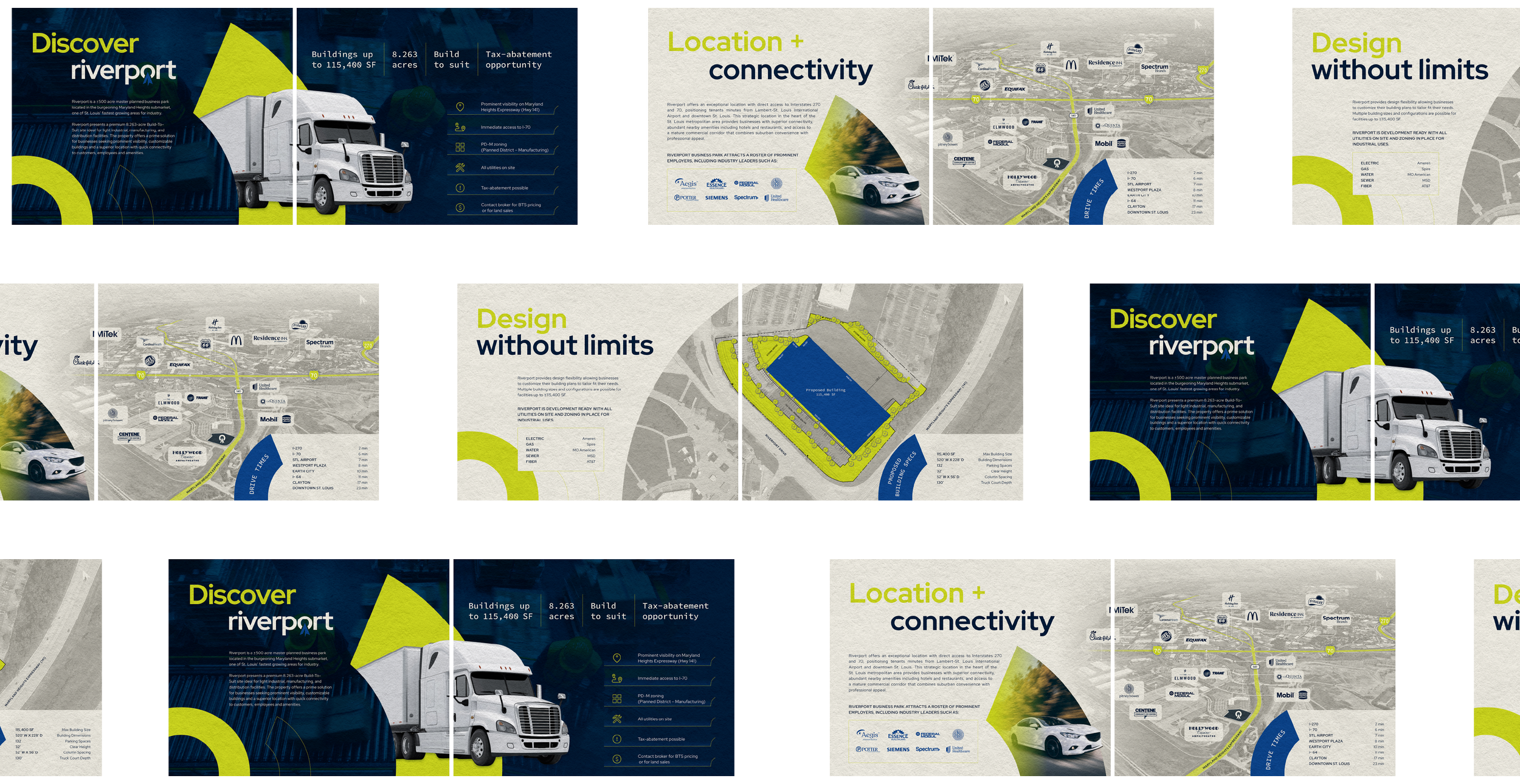
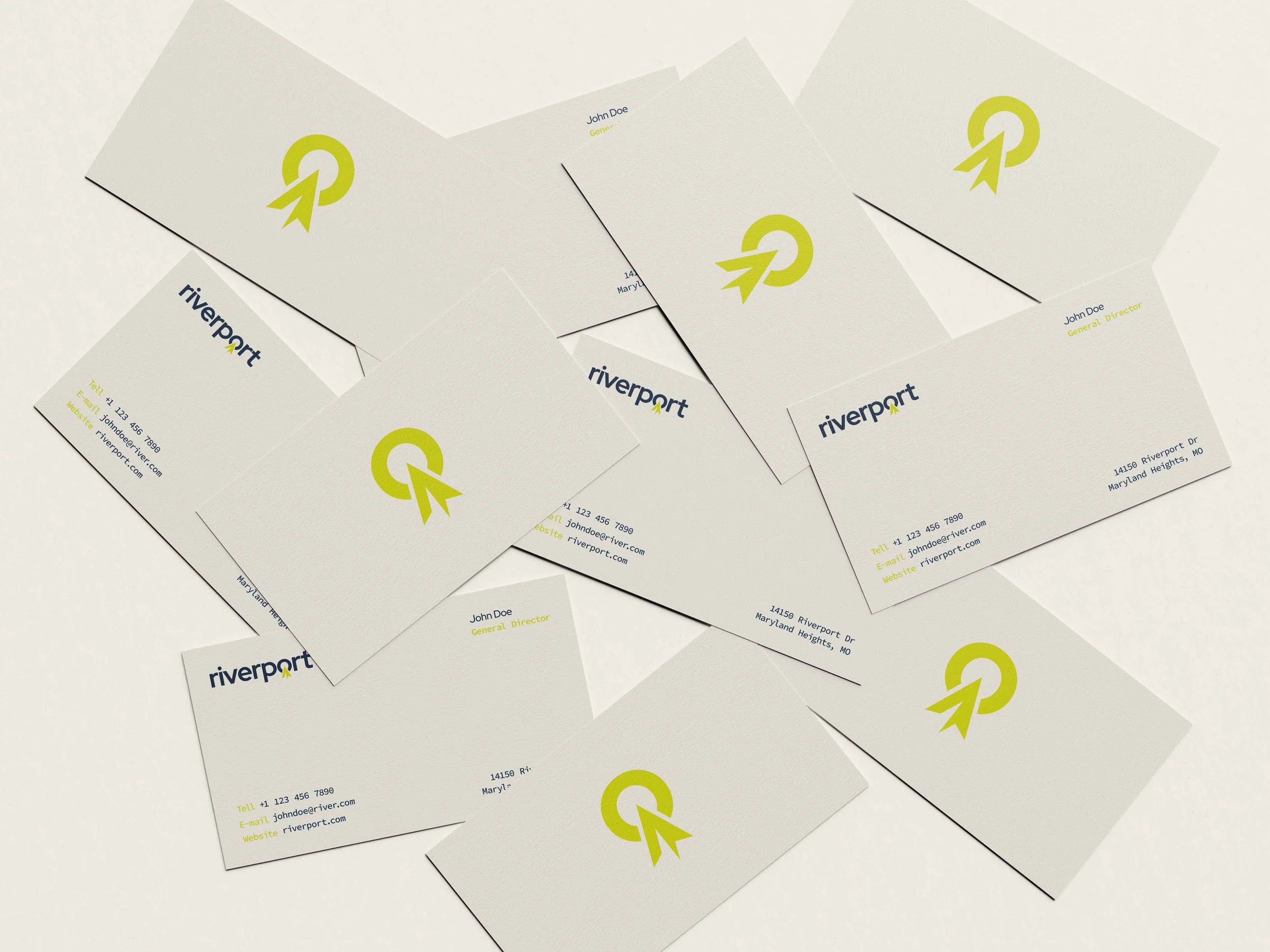
Create a brand identity for Riverport, a 115,400 SF industrial development in Missouri, that emphasized strategic location advantages and stood out in signage applications to attract logistics and manufacturing tenants.
APPROACH
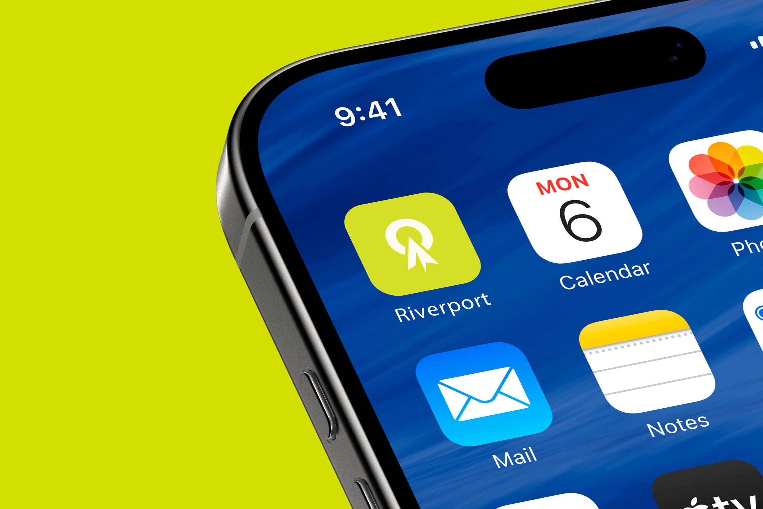
I integrated a directional arrow into the 'o' of Riverport to symbolize multimodal connectivity and the property's position at major interstate intersections near Lambert-St. Louis Airport. Bold colors and geometric typography optimized visibility and reinforced industrial credibility.
OUTCOME
The brand effectively communicated transportation advantages through smart visual storytelling. High-impact signage and a modern, professional identity resonated with the target audience while differentiating the property in the industrial market.
FAUX
CHALLENGE
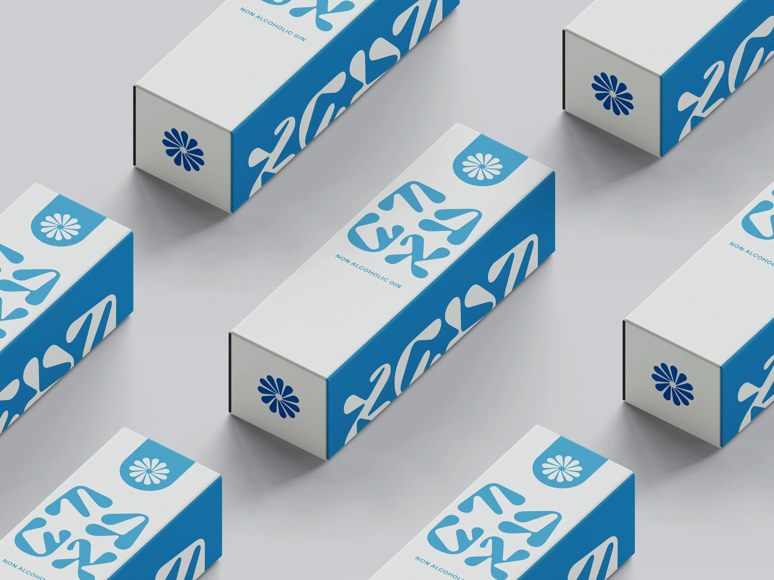
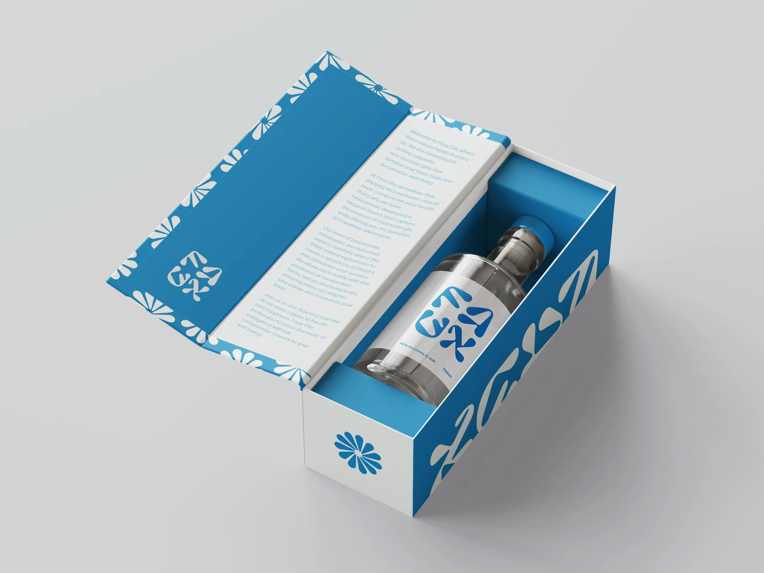
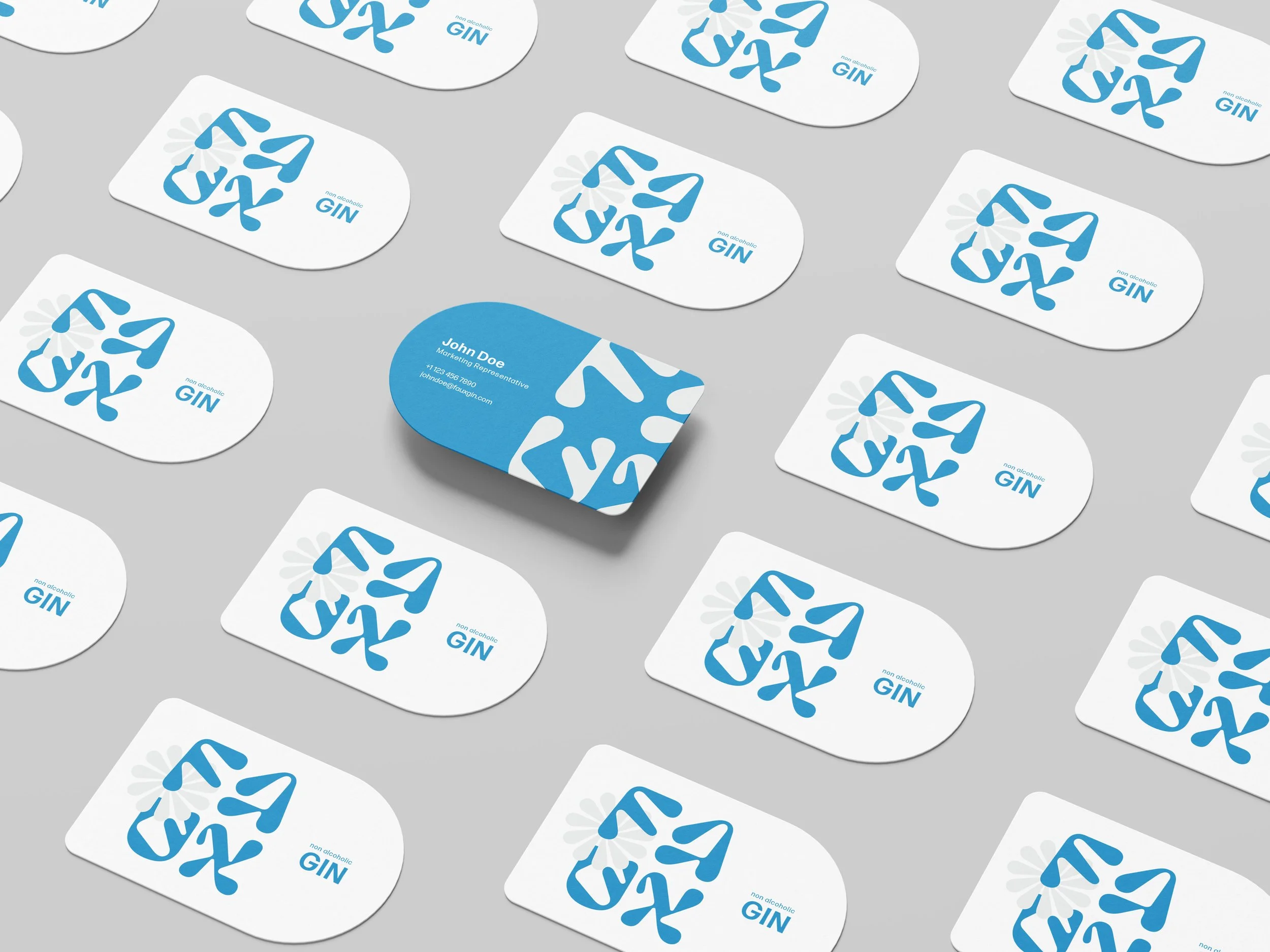
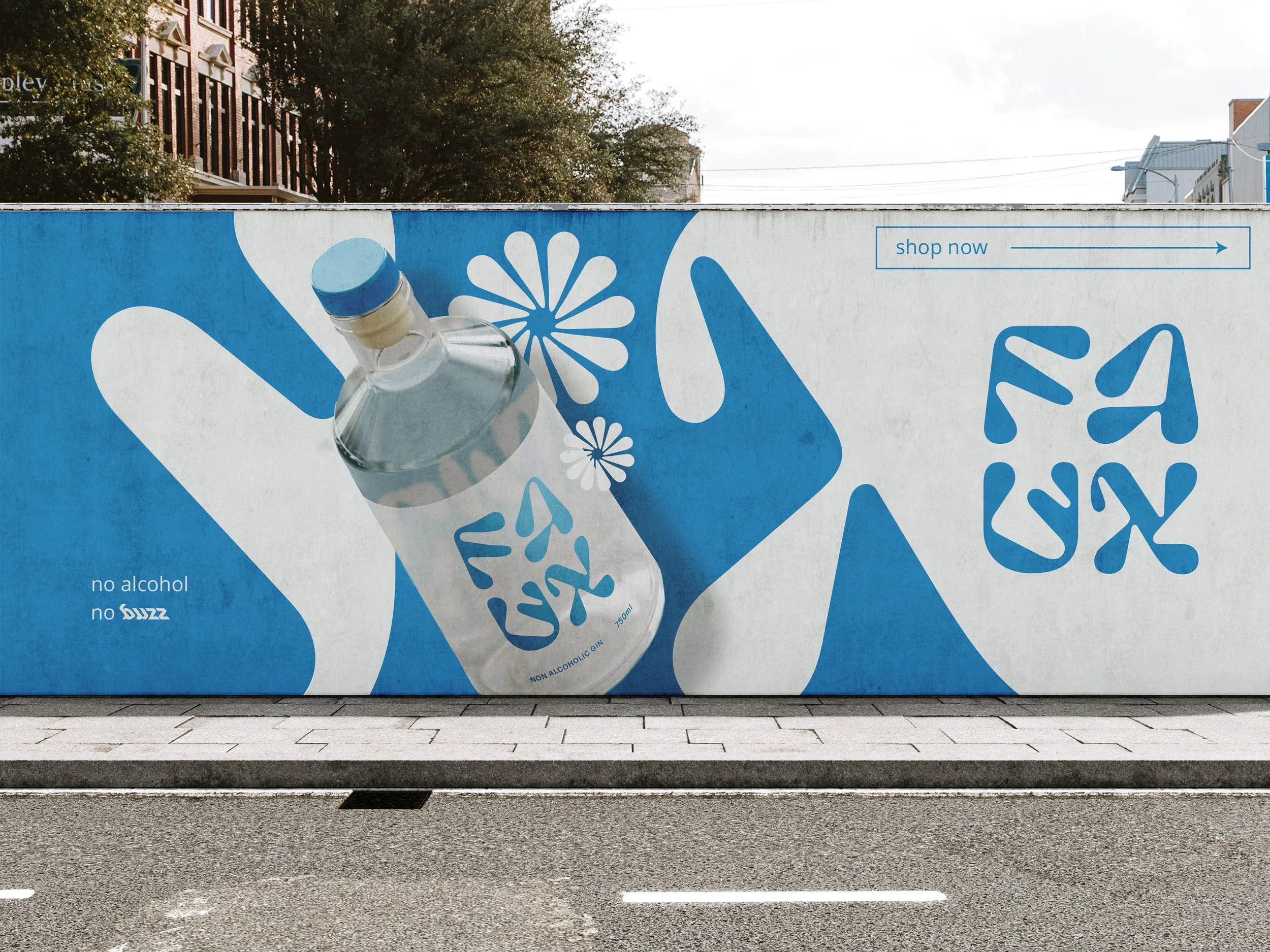
Create a full brand identity and packaging system for Faux Gin, a non-alcoholic spirit targeting sophisticated drinkers seeking elevated alternatives without typical "mocktail" aesthetics.
APPROACH
I developed a refined visual identity balancing clean minimalism with subtle botanical references that echo gin's complexity while feeling contemporary. The packaging was designed for bar cart appeal—elegant yet approachable—speaking to both wellness-conscious consumers and cocktail enthusiasts.
OUTCOME
Faux Gin launched with a distinctive identity that differentiated the brand in the growing non-alcoholic market, securing placement in boutique retailers and bars while resonating with a design-forward audience.